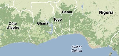
This collection of visualizations of open data feeds some background work for the dissertation proposal. It’s an attempt to find open areas for questioning. Some issues that can be noted from these graphs: Why does the pattern of Internet adoption in the region under discussion diverge from that of the global aggregate? What are the mutual effects of human development, political changes, economic patterns, and technological movements over time? Finally, what, if anything, do these numbers tell us about the relations between those in power and those without power in the region? Though the straightforwardly quantitative measurements here appear simplistic, the concatenation of assumptions and abstractions that found them lead to further complexity, not less. So:
The relative positions of the countries that I am studying, in terms of the U.N. Human Development Index: